CMYK vs RGB: What's the Difference and When to Use Each
The difference between CMYK and RGB color modes — when to use each, how to convert between them, and how to avoid common color mistakes in print.
If you've ever designed something on screen that looked perfect — then printed it and watched the colors come out flat, muddy, or completely wrong — you've run into the CMYK vs RGB problem. It's one of the most common issues in print production, and it comes down to understanding how color works in two fundamentally different systems.
This guide explains what CMYK and RGB are, when to use each, how to convert between them, and how to avoid the mistakes that cost print businesses time and money.
What Is RGB?
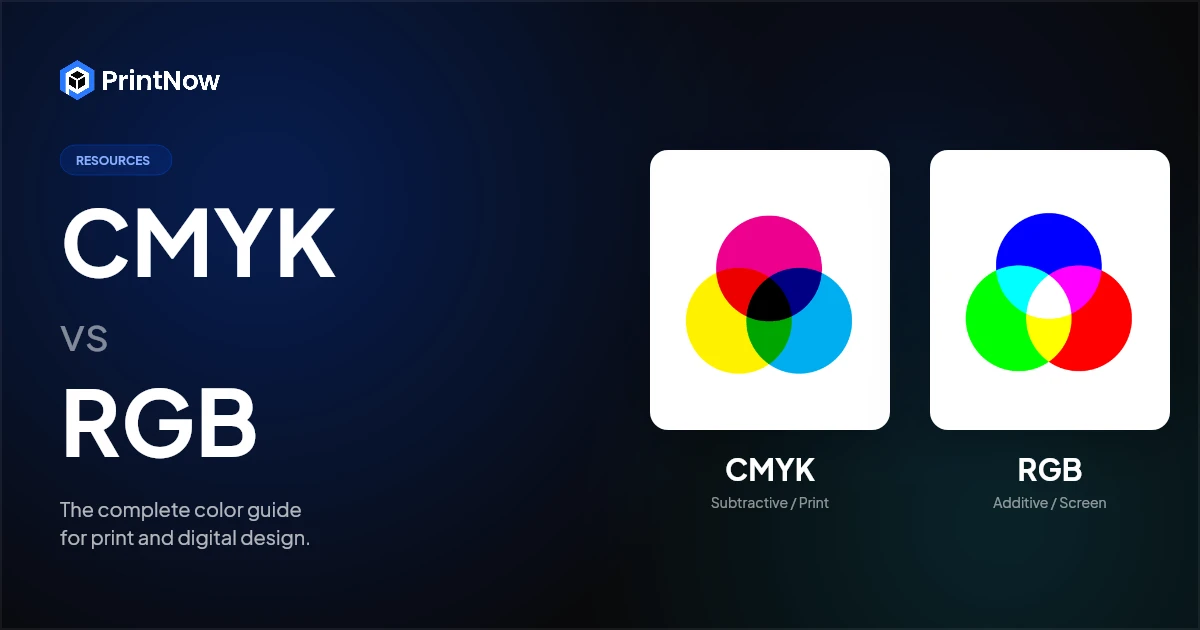
RGB stands for Red, Green, Blue — the three colors of light that screens use to display color. Every pixel on a monitor, phone, or tablet is made up of tiny red, green, and blue sub-pixels. By mixing these three light sources at different intensities, screens can produce millions of colors.
RGB is an additive color model. When you combine all three colors at full intensity, you get white. When all three are off, you get black. This is how light works — adding more light creates brighter, more vivid colors.
Key characteristics of RGB:
- Color range (gamut): ~16.7 million colors
- Medium: Screens, monitors, projectors, cameras
- Brightness: Can produce very bright, saturated colors — neon greens, electric blues, vivid magentas
- File formats: JPEG, PNG, GIF, SVG, most web formats
- Color values: Each channel ranges from 0–255 (e.g., pure red = R:255, G:0, B:0)
When to use RGB: Anything that will be viewed on a screen — websites, social media, email, digital ads, video, presentations, mobile apps.
What Is CMYK?
CMYK stands for Cyan, Magenta, Yellow, Key (Black) — the four ink colors used in commercial printing. When you send a file to a printer, it gets separated into these four channels. Each channel controls how much of that ink gets laid down on the paper.
CMYK is a subtractive color model. Ink absorbs (subtracts) light rather than emitting it. When you combine cyan, magenta, and yellow ink at full strength, you theoretically get black — but in practice it produces a muddy dark brown, which is why black ink (the "Key" plate) is added separately.
Key characteristics of CMYK:
- Color range (gamut): Smaller than RGB — roughly 55–60% of the colors RGB can produce
- Medium: Offset printing, digital printing, large format printing, packaging
- Brightness: Cannot match the vibrancy of screen colors — no true neon or electric shades
- File formats: PDF/X, TIFF, EPS, AI (when set to CMYK color space)
- Color values: Each channel ranges from 0–100% (e.g., a rich black might be C:60, M:40, Y:40, K:100)
When to use CMYK: Anything that will be physically printed — business cards, brochures, banners, packaging, labels, posters, catalogs, direct mail.
CMYK vs RGB: The Key Differences
| RGB | CMYK | |
|---|---|---|
| Color model | Additive (light) | Subtractive (ink) |
| Primary colors | Red, Green, Blue | Cyan, Magenta, Yellow, Black |
| White | All colors at full intensity | No ink (paper color) |
| Black | All colors off | Key plate (K) ink |
| Color gamut | ~16.7 million colors | ~55-60% of RGB gamut |
| Best for | Screens, digital, web | Print, packaging, physical media |
| Bright neons | Yes | No — cannot be reproduced |
| File size | 3 channels (smaller) | 4 channels (larger) |
| Industry standard | sRGB for web, Adobe RGB for photography | FOGRA39 / GRACoL for print |
The most important difference is the gamut gap. CMYK simply cannot reproduce every color that RGB can display. Bright oranges, vivid greens, electric blues, and neon pinks that look stunning on screen will shift when converted to CMYK. This isn't a software bug — it's physics. Ink on paper cannot emit light the way a screen does.
When to Use RGB vs CMYK
Start in RGB When:
- You're designing for screen-first delivery (web, social, email)
- You're working with photographs (cameras capture in RGB)
- You need the widest color range for creative exploration
- The file may or may not end up in print — RGB gives you more options later
Start in CMYK When:
- The design is exclusively for print (no digital version needed)
- You're working within specific ink limitations and need accurate on-screen proofing
- Your print provider requires CMYK-separated files for production
- You're designing packaging with Pantone spot colors (start in CMYK, add spot channels)
The Practical Rule
Most designers today start in RGB and convert to CMYK at the export stage. This gives you the widest creative range during the design process and lets you produce both digital and print outputs from the same source file. The conversion step is where you catch and fix any color shifts before going to press.
The 5 Most Common CMYK/RGB Mistakes
1. Designing in RGB and Sending Directly to Print
This is the most common mistake. The file looks great on screen, but the printer converts it to CMYK automatically — often with poor results. Colors shift unpredictably because the printer's automated conversion doesn't know which colors matter most to your design.
Fix: Always convert to CMYK yourself before sending to print. Review the converted file on screen and adjust any colors that shifted unacceptably.
2. Using Neon or Electric Colors in Print Designs
RGB can display colors that CMYK physically cannot reproduce. Neon green (#39FF14), electric blue (#7DF9FF), or hot pink (#FF69B4) will all shift dramatically in CMYK. If your brand relies on these colors, you'll need spot colors (Pantone inks) to achieve them in print — standard CMYK won't get there.
Fix: Check your key brand colors in CMYK early in the design process. If critical colors fall outside the CMYK gamut, plan for spot color printing or adjust the palette.
3. Using Pure Black (K:100) for Large Solid Areas
In CMYK, K:100 alone produces a dark charcoal gray, not a true deep black. Large black areas printed with only the black plate look washed out and can show press artifacts (banding, roller marks).
Fix: Use a rich black formula for large solid areas. A common formula is C:60, M:40, Y:40, K:100. This produces a deep, dense black. Don't use rich black for body text — only for large fills, backgrounds, and bold graphic elements.
4. Not Soft-Proofing Before Sending to Press
Soft proofing simulates how a CMYK file will look when printed on a specific paper stock. Without soft proofing, you're guessing how colors will shift. What looks vibrant on your calibrated monitor may look dull on uncoated stock.
Fix: Use soft proofing in your design software with the correct ICC profile for your paper stock (coated vs. uncoated). Most professional design tools support this — Photoshop, Illustrator, InDesign all have soft proofing built in.
5. Ignoring Total Ink Coverage
Each CMYK channel can apply up to 100% ink. If all four channels are at 100%, that's 400% total ink coverage — far too much for any printing process. Excess ink causes smearing, drying problems, and show-through on the back of the sheet.
Fix: Keep total ink coverage below 300% (most commercial printers recommend 280% or less). Check your design software's separations preview to spot areas that exceed the limit.
How to Convert RGB to CMYK
In Adobe Photoshop
- Open your RGB file
- Go to Edit → Convert to Profile
- Select a CMYK profile (e.g., "U.S. Web Coated (SWOP) v2" for coated paper)
- Choose Perceptual or Relative Colorimetric rendering intent
- Review the preview — check for unacceptable color shifts
- Click OK, then save as PDF/X or TIFF for press
In Adobe Illustrator
- Go to File → Document Color Mode → CMYK Color
- Illustrator converts all objects. Check swatches — any RGB swatches will be converted
- Review and manually adjust any colors that shifted
In Canva, Figma, and Web-Based Tools
Most web-based design tools work exclusively in RGB. If you're designing for print in these tools, you'll need to export as PDF and convert separately — either in Photoshop/Illustrator or through your print provider's preflight process. This extra step is one reason print professionals typically use dedicated design software or web-to-print editors with built-in CMYK support.
In a Web-to-Print Workflow
Modern web-to-print platforms handle color conversion automatically as part of the production pipeline. Customers upload designs in any color space — the system converts to CMYK using the correct ICC profiles for the selected product and paper stock, flags out-of-gamut colors, and generates print-ready output. This eliminates the most common conversion errors because the rules are built into the workflow rather than depending on individual designer knowledge.
PrintNow's Print Editor supports both RGB and CMYK workflows. Templates can be locked to specific color spaces, and the system automatically generates press-ready PDF output with correct separations — whether the customer uploaded an RGB JPEG or a CMYK TIFF.
Spot Colors: Beyond CMYK
Standard CMYK covers most commercial print jobs, but some colors can only be achieved with spot inks — pre-mixed Pantone (PMS) colors that are printed as a separate plate. Spot colors are essential for:
- Brand-critical colors that must be exact across all printed materials
- Metallic inks (gold, silver, copper)
- Fluorescent/neon colors that fall outside the CMYK gamut
- White ink for printing on dark or transparent substrates
- Packaging where brand consistency across substrates is critical
Spot colors add cost (each spot color = an additional print plate), but they solve the gamut problem for specific critical colors.
Quick Reference: Color Mode Cheat Sheet
Designing for the web? → RGB (sRGB color space)
Designing for print? → CMYK (check with your printer for the correct ICC profile)
Designing for both? → Start in RGB, convert to CMYK at export
Brand colors look wrong in CMYK? → Consider Pantone spot colors for critical hues
Sending customer files to a printer? → Use a web-to-print workflow with automatic color management
Large black areas? → Use rich black (C:60, M:40, Y:40, K:100), not K:100 alone
Total ink too high? → Keep below 300% (280% recommended)
Understanding CMYK vs RGB isn't just a design skill — it's a production skill that saves time, money, and reprints. Whether you're a designer sending files to press, a print shop receiving customer artwork, or a business running an online print storefront, getting color right the first time is the difference between a satisfied customer and an expensive reprint.
For print businesses looking to automate color management across hundreds or thousands of customer orders, see how PrintNow handles the entire workflow — from customer upload through press-ready output.